The challenge is simple:
Create a pie-chart based on a number of input values.
The input will be a list of positive numbers, decimal or integers, and the output will be a pie-chart where each of the input values are represented by separate colors, and a percentage value outside each of the areas.
Rules:
- The colors must be visually distinguishable (the exact colors are optional)
- There will be at least two, and maximum 10 input values
- The radius of the circle must be in the range
[100 300]pixels- Vector graphics are OK as long as the default output gives a radius of
[100, 300]pixels
- Vector graphics are OK as long as the default output gives a radius of
- The percentage values shall be integers
- There is no strict rule saying where the percentage value shall be placed, but it must be easily seen which area it belongs to
- The distance between the closest character and the outer edge of the circle must be in the range
[5, 40]pixels - The font is optional
- The plot may or may not have black lines separating each region
- Functions made for creating pie charts, for instance, MATLAB:
pie, Python:matplotlib.pyplot.pieand Mathematica:PieChartare not allowed - Normal rounding rules (up if it's
(1.00, 0.5], down if it's(0.5, 0.00)) - If the percentage value of a slice is smaller than
0.5%, output0%. The slice must still be included in the plot. - Please provide plots for examination (or a link to an interpreter). It's enough to show only the plot with 10 input values (to avoid very long answers)
Examples
Please use the example values below. You can convert the lists to an appropriate format using a numeric list converter, for instance this 27 byte one by jimmy23013.
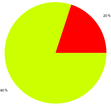
x = [0.3, 1.2]
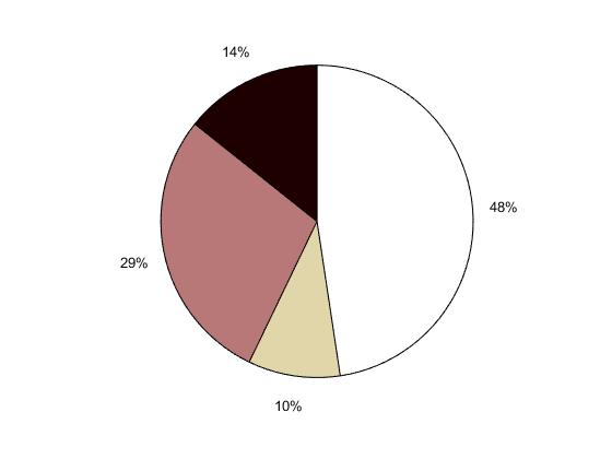
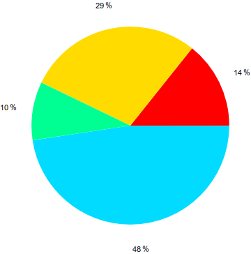
x = [3, 6, 2, 10]
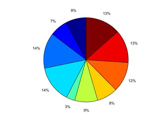
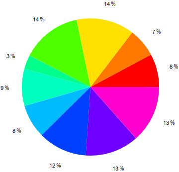
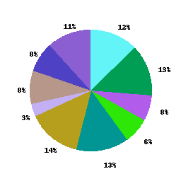
x = [0.4387, 0.3816, 0.7655, 0.7952, 0.1869, 0.4898, 0.4456, 0.6463, 0.7094, 0.7547]



0.5to zero if that's default. But0.50001must be rounded to 1. \$\endgroup\$